Start with the moment of use
Measurement marks often look like a minor graphic detail, but they sit at the intersection of the container, its contents and the person holding it. Someone filling a measuring cup may glance at the scale while pouring. Someone checking a storage bottle may set it on a counter and bend down to see the remaining amount. Before drawing a single line, decide which of these actions the marks need to support.
The container’s shape matters as much as the lettering. A handle can cover a scale when the vessel is held in the most natural way. A curved wall can distort marks viewed from an angle. A wide rim may cast a shadow over the upper readings. Place a draft scale on a paper mock-up or sample container, then hold it as a user would. The easiest place to print is not always the easiest place to read.
Build a scale with a clear hierarchy
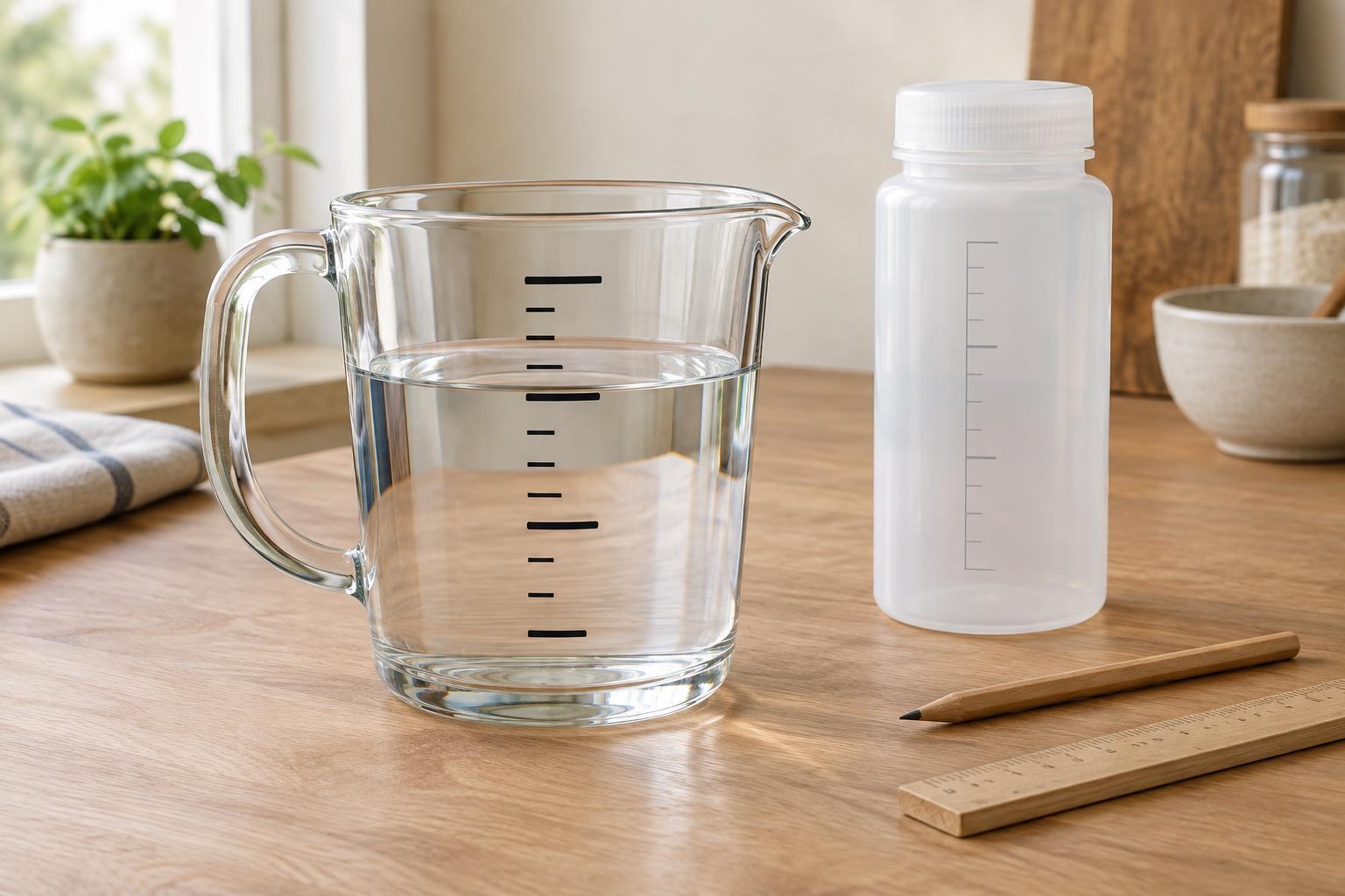
A useful scale lets the eye find a major value first and estimate between values second. Make the primary intervals longer or heavier, use shorter marks for subdivisions, and label only as many values as the space can comfortably hold. If every tick and number has equal emphasis, the reader must work harder to find a target amount.
Choose subdivisions to suit the likely task. A container meant for rough mixing does not need the visual density of a vessel intended for small additions. More marks do not automatically make a container more useful; closely packed ticks can be hard to distinguish, especially on a narrow surface. Keep numbers consistently aligned with their marks, and leave enough space that one value cannot be mistaken for its neighbor.
If the container shows more than one unit system, give each scale its own visual path. Opposite sides of the vessel, separate columns, or distinct label styles can help prevent a number from being paired with the wrong unit. Label the units clearly rather than relying on a familiar-looking pattern of marks.
Design for contents, light and wear
A scale that is crisp on an empty container may disappear when the container is full. Dark markings can stand out against milk or flour but blend into coffee or a dark liquid; pale markings may do the reverse. Transparent walls also pick up background clutter. Test markings with plausible contents and place the container against both light and dark surroundings.
Contrast is not only a question of ink color. Line width, type size and the finish of the surface all affect readability. Molded-in markings avoid printed ink but may have little contrast unless light catches their edges. Etched or embossed numbers can be attractive yet difficult to read at a glance. A contrasting panel behind the scale can help, provided it does not hide the level being measured.
Consider what cleaning and repeated handling will do to the marks. Put printed details where routine gripping and scrubbing are less likely to wear them away, and check that the chosen marking method suits the container material and expected care. A beautiful new scale is of limited value if its smallest labels become unclear in ordinary use.
Make the level easy to judge
Reading a liquid level involves more than finding a number. The user needs to see where the surface meets the scale, ideally with the container resting level and the eye near the height of the liquid. Marks tucked around a corner or behind a thick handle make that comparison awkward. A straight-sided reading area can be helpful even when the rest of the vessel is rounded.
Some liquids form a visible curve at the edge, while foam or suspended ingredients can obscure the surface. An everyday container cannot remove every ambiguity, but its markings should not add another one. Keep the tick connected visually to its number, avoid decorative lines that resemble ticks, and ensure the scale can be seen without an uncomfortable grip or an unusually precise viewing angle.
Mark placement should also match the volume the container can practically hold. If the highest labeled line sits too close to the rim for comfortable pouring or carrying, it may invite spills. Likewise, leave usable space below the first marked value if people are likely to measure small amounts.
Test the scale as an object, not just an image
Before committing to a finished design, put a trial scale on a physical container. Ask someone unfamiliar with it to find several values, pour to a chosen mark and read what remains. Watch where they place their hand, whether they rotate the container, and which numbers they hesitate over. Those observations can reveal problems a flat drawing will miss.
Check the marks at different fill levels and from the positions the container will actually be used in: on a worktop, held under a tap, or stored on a shelf. If an interval is difficult to read, the answer may be to remove minor ticks, enlarge a label or move the scale rather than add more information. Good measurement graphics are quiet: they make the needed value easy to locate and leave the container comfortable to use.